To emphasize structure and flow, the low-fidelity wireframes excluded images and custom fonts. View it in Penpot ➚.
Student Energy
Redesign of the homepage, adding functionalities, maintenance
The project
Student Energy, a youth-led organization advancing the energy transition, identified several areas for improvement on their website in early 2024. The goals were both technical and strategic: modernize their backend systems, address security and performance concerns, and redesign the homepage to better reflect their expending programs.
The site ran on WordPress with a heavily customized PHP theme and ACF Pro. While functional, its underlying systems were out of date: core systems needed updates, dependencies hadn’t been maintained, and unused user roles and overdue security checks posed risks.
Visually and structurally, the homepage no longer represented the diversity of Student Energy’s offerings. With new programs like Career Training, Guided Projects, and the Fellowship expanding rapidly, there was a need to present these streams clearly and interactively.
The work was structured around system updates, security hardening, and the design and implementation of a refreshed, user-centered homepage. All changes needed to be staged, tested, and deployed with minimal disruption to daily operations.
The solution
The solution came together through three parallel workstreams, strategy, UX design, and backend engineering.
I upgraded the site’s core systems - WordPress, PHP, MySQL, and dependencies - resolving breaking changes along the way. To improve performance and scalability, I added Redis caching, enabled HTTP/2, and minified assets. The result: faster load times and a more reliable experience for global users.
A major piece of the puzzle was the transformation of the homepage. We kicked things off with low-fidelity wireframes in Penpot (a Figma alternative) to explore layout ideas :
.](/_astro/se-low-fidelity-prototype.BkXBsmbn_Z3xE12.webp)
This followed by a high-fidelity prototype, which was designed to be as close to the final look as possible :
.](/_astro/se-high-fidelity-prototype.CeOXED_L_qvDsx.webp)
To keep the focus on content presentation, this version avoids using images and custom fonts. Explore the interactive high-fidelity prototype ➚.
Both of the low and high fidelity prototypes were tested with actual users to validate the UX approach and ensure alignment with Student Energy’s communication goals.
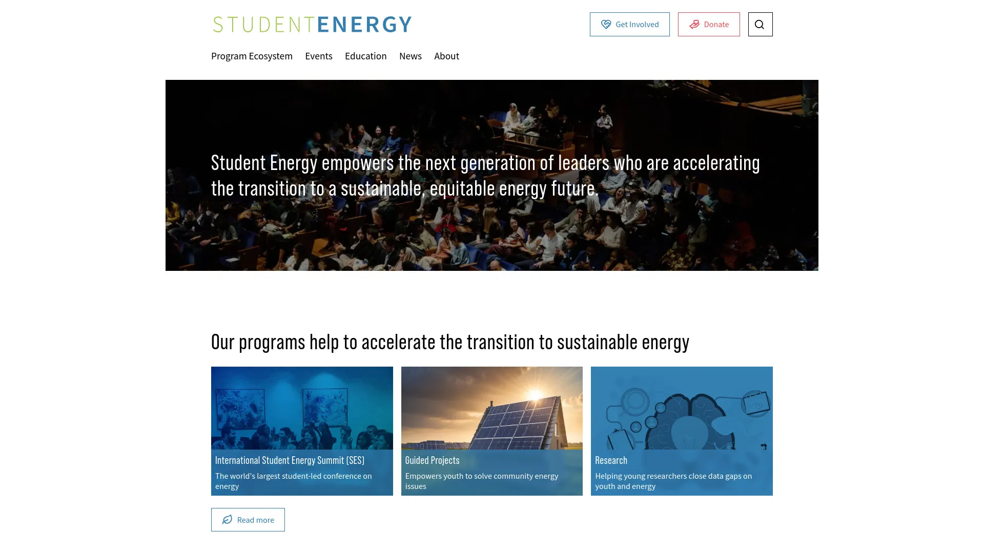
Finally, the design was implemented on the actual site :
.](/_astro/se-live-site.CYR6GYnT_Z1cjpu7.webp)
Even after the high-fidelity prototype was finalized, only minor adjustments were necessary. The live site closely reflects the approved design. Visit the live site ➚.
The final homepage integrates dynamic, interactive maps that showcase each of the organization’s programs, pulling data directly from custom post types on WordPress. We also introduced program-specific testimonials, fine-tuned user roles to streamline content visibility, and resolved compatibility issues from the PHP upgrade with minimal disruption to live operations.
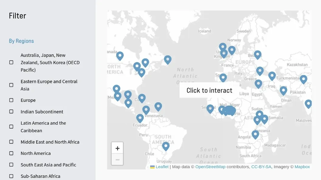
A dynamic map was envisioned as a central feature, highlighting participant locations across programs and bringing the organization's global impact to life.
Collaboration was integral throughout. I partnered with the internal team to explore multiple solution paths, iterate based on feedback, and ensure every decision aligned with Student Energy’s mission. The result: a faster, more expressive site that scales with their global reach.